Getting started with accessibility for digital environments can be a complex, sometimes confusing process. Looking at the WCAG guidelines alone can make the path to accessibility seem as if it’s filled with insurmountable obstacles. But, it doesn’t have to be – learning a few core concepts will set you on the right track. And one of the most important tools you need to know about is alt text.
What is alt text?
Alt text is essentially a short text tag added to images on a web page or in a document. It’s a way of describing images for people who are unable to see them, usually because they have a vision-related disability. It’s generally not visible on the page like a caption would be, but it’s an essential requirement for people who use screen readers. For more details on what alt text is and why it’s so important, check out Lucy Arthur’s post Why alt text matters.
Writing good alt text
There’s no single right way to write alt text, but there are some things you should aim to avoid. Here are a few principles to keep in mind when you’re creating alt text.
Purpose or function
Why are you using that particular image? What do you want your audience to take away from it? Writing your alt text with the purpose of the image in mind will help users to connect the overall content of the page with the images you include, ensuring that they do not miss out on any important details.
Here’s an example. Say you have a picture like the one below, which shows the Shibuya crosswalk in Tokyo, Japan. If your written text is explaining that this is the busiest pedestrian crossing in the world, your tag might read ‘A birds-eye view of hundreds of people walking on the Shibuya crosswalk’. However, if you were instead writing about the entertainment options in the area, your tag could say ‘The busy Shibuya crosswalk, surrounded by skyscrapers housing a variety of shops and restaurants’. The level of detail and your focus will change depending on your content, as well as the purpose of the image.

Details
Include enough detail to ensure that your reader can get a sense of what’s in the image. Vague alt text tags that don’t provide much additional information might have the unfortunate consequence of confusing your reader rather than making your content clearer. For the image below, if the tag read ‘an Amsterdam street’, or ‘houses in Amsterdam’, it would be correct – but what value has that description added? With just a little more detail, you can create more informative alt text like ‘a canal in Amsterdam lined with traditional, colourful Dutch houses’. As above, the details you add will depend on the purpose of your image.

Length
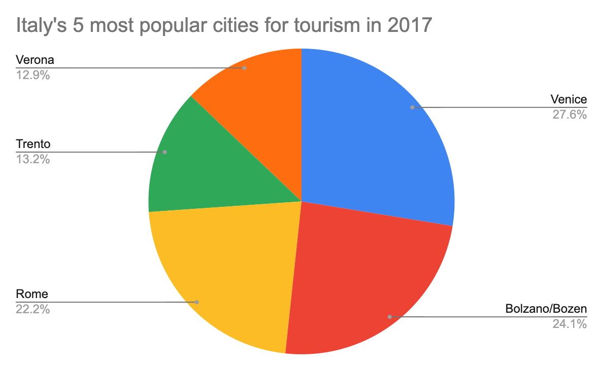
Keep it short and sweet. This can be difficult if your images contain a lot of detail – for example, when using graphs or charts. The best way to mitigate these problems is to have a short description of the image in the alt text field, and include a longer description on your page if necessary (or a link to a longer description as a last resort). For example, an alt text tag for the pie chart below might say ‘a pie chart showing the five most popular cities in Italy for tourists’, while you could include more detailed information on your page in text format like this: ‘The five most popular cities in Italy for tourists in 2017 were Venice (27.6% of visitors), Bolzano/Bozen (24.1 of visitors), Rome (22.2% of visitors), Trento (13.2% of visitors) and Verona (12.9% of visitors).’

Marking decorative images
And the last tip is an easy one to remember. Are you using an image for decorative purposes, like a border, banner or logo? If it’s not essential for understanding the written content, save yourself and your reader time by marking the image as decorative. This tag will tell screen readers that the image can be skipped over, making the browsing experience for screen reader users even smoother. It’s still important to mark these images, because not filling in the alt text box will instead mean that the screen reader only sees an image with no alt text attribute, and then your reader won’t know whether it was important or not. The red arrow in the image below points to a swirly decoration underlining the heading – an example of a decorative image.

Where to add alt text
This varies depending on which platform you’re using, but it’s usually easy enough to find. In Canvas, after you use the Canvas Rich Text Editor to embed your image, you can add and edit alt text in the image tab on the right. UTSOnline is a little different, as the term used is ‘image description’ rather than alt text. Use the Insert/Edit Image page and add your alt text in the ‘image description’ field. For Microsoft Word or PowerPoint, you can right click the image and select ‘Edit alt text’ from the right click menu. If you’re struggling to find where to add alt text in the platform you’re using, Google the name of the platform with ‘add alt text’ and you should find your answer.
Why does alt text matter?
There are actually many screen reader users at UTS, so even if you don’t think there’s anyone in your class who has these accessibility requirements, you might be surprised. Making sure that digital environments are accessible for all users is also a really important part of creating inclusive learning experiences. The challenges of inaccessible environments, both physical and digital, can make people with disabilities feel marginalised and isolated. By making a little extra effort to make your content accessible, you can ensure that you’re welcoming all of your readers and students.
Keeping accessibility in mind can improve your content too – if you have to stop and think about why you’re using an image, or how that image might be expressed in an alternative format, it can actually be a helpful way of refining your content and removing any redundant elements. And last but not least, there are clear UTS guidelines about making content accessible – you can find more information in the UTS Access and Inclusion Plan.
For more information on digital accessibility, take a look at our accessibility resources. The LX.lab also sometimes hosts accessibility events and workshops, which you can keep in touch with by checking out our Events page or signing up to the Futures newsletter.
Feature image by Erik Odiin.
