Still need help?
Get in touch with the LX.lab team by logging a ticket via ServiceConnect. We'll be in touch shortly.
Log a ticketWant to provide feedback on this resource? Please log in first via the top nav menu.
Canvas has been designed to help you create a clear, logically organised online space for your students. It does this by grouping your subject’s content into Modules – sequences of pages containing learning materials that can be interspersed with assignments, quizzes and discussions. The standardised page design, combined with the page templates provided by the LX.lab, enables you to create simple, clean pages that are both visually appealing and effortlessly readable.
The following examples demonstrate some of the ways Subject Coordinators at UTS have effectively used Canvas Modules and Pages to clearly guide their students through their subject’s learning materials.
In this example, the Subject Co-ordinator has identified the topic and contents of their Modules by using a simple and clear naming structure that identifies the ideas that will be covered and the order they will be encountered by students. Note that each Module contains both an Overview and Summary page to help students orient themselves in the subject and to help them check that they have understood key concepts.

The Subject Coordinator for this subject has provided their students with even more detail. They have not only clearly named the Module, but also created a structure that guides students through the learning materials, recorded lectures, live tutorials, comprehension activities and, finally, a reflection on learning. This linear structure provides students with a well-mapped-out learning journey.

While the Modules area of Canvas allows you to provide students with a clear guide to your subject’s learning materials, activities, classes and assessments, this is not the only way you can clearly present your course structure to them. In this example, the Subject Coordinator has used pictures on the Canvas homepage to provide students with a visually appealing direct link to introductory information and the subject’s Modules.

By including a clear guide to the schedule of their subject, this Canvas homepage ensures that students can quickly access information about the topics that will be covered, upcoming assessments and embedded support programmes. The simple table design provides a straightforward, accessible snapshot of each week.

The LXT Canvas Shell contains a template for both a Module Overview and a Module Summary. These pages allow you to orient your students in your subject and to provide them with a guide to the knowledge and skills that they will gain in each Module.
In this example, the Subject Coordinator has provided a brief outline of the Module’s topic and given students five key questions that their engagement with the learning materials will provide answers to:

At the end of this Module, the summary reminds students of the theories and concepts they have looked at. It then provides some additional learning materials to encourage students to delve deeper into their chosen area of study. This page also clearly and explicitly guides students through their end-of-Module task, a critical reflection.

One of the most appealing aspects of Canvas is the way that it allows you to create well-structured and easily understood pages. In this example of a subject welcome page, the use of headings gives students an explicit guide to the page’s clearly staged content. Note that the heading ‘Watch’ is followed by a sentence that provides a preview of the embedded video, giving students encouragement to engage with its content.

To help Subject Coordinators transition into Canvas more easily, the LX.lab team has provided a set of templates that can be copied into subject sites. These templates enable you to create clearly structured, visually appealing pages.
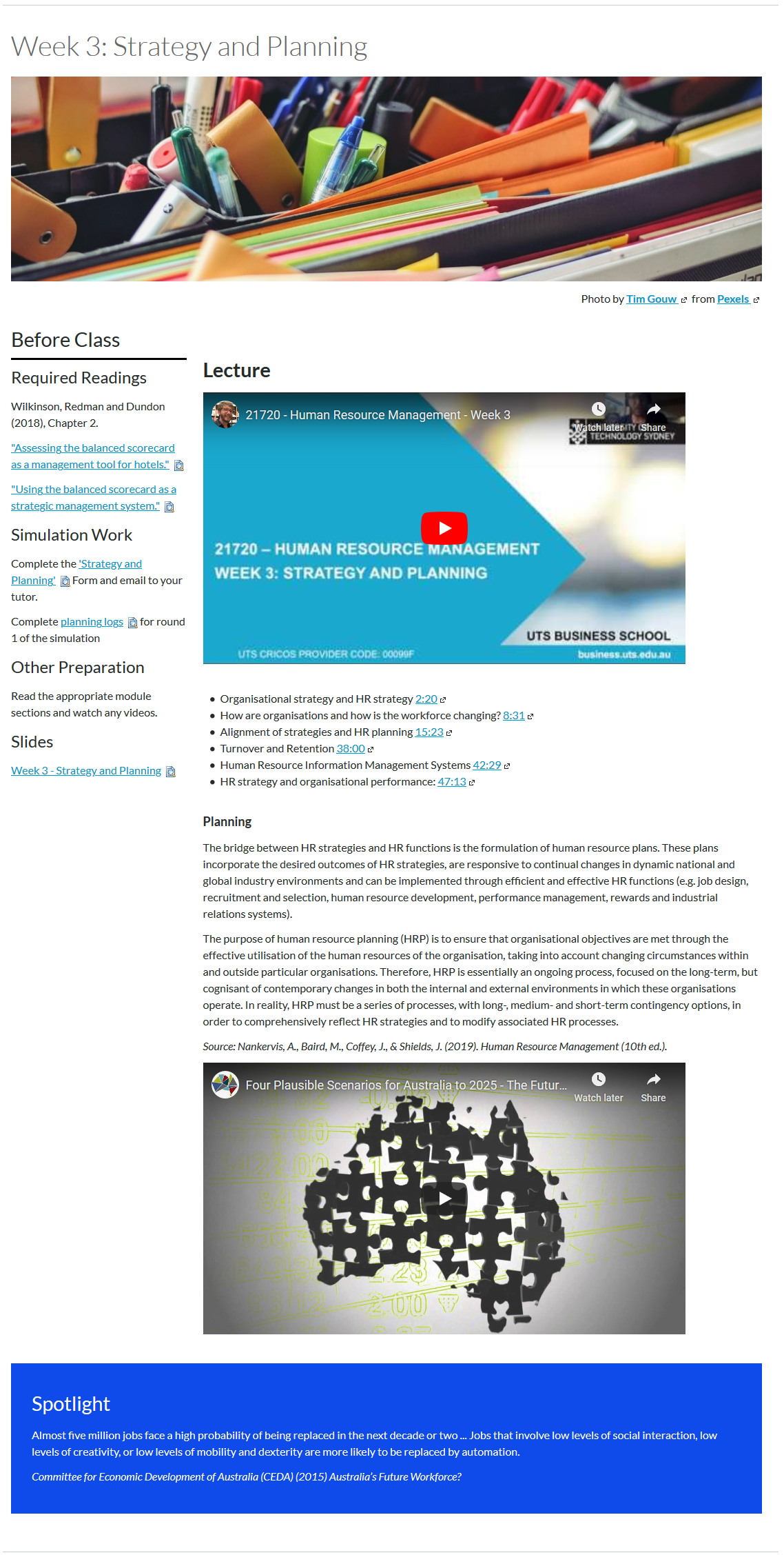
This Subject Coordinator has adapted an LX.lab template to create a straightforward page containing pre-lecture preparation tasks, the lecture and follow-up, bonus materials. This concise design is easy for students to navigate and enables them to quickly access all of the required materials.
If this template appeals to you, it’s known as the ‘Road map of the week (or topic)’ page in your faculty template sites.

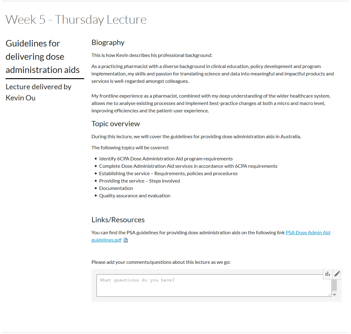
The LX.lab’s guest lecturer template has been used to great effect here. There is an introduction to the lecturer, as well as an overview of the topic and a link to a key reading. The embedded comments box allows students to share their thoughts and questions during the guest lecture without interrupting the flow of the presentation itself.

Get in touch with the LX.lab team by logging a ticket via ServiceConnect. We'll be in touch shortly.
Log a ticketWant to provide feedback on this resource? Please log in first via the top nav menu.