Canvas makes it easy to create an attractive subject site and a clear structure for your students to follow. But some simple mistakes can confuse your students and waste your precious time. The LX.lab team have collected together some common oopsies we have seen in Canvas sites, and how to fix them.
1. Using a table for formatting content
This is an absolute mess for people using screen readers and difficult for anyone accessing from a mobile.
The fix: Keep formatting simple, or if you’re feeling adventurous, speak to the LX.lab team about some simple html for formatting in responsive columns and boxes.
2. Leaving the yellow highlighting from the Canvas shell
The yellow highlighting is just there to guide you through the content you need to update in the Canvas shell.
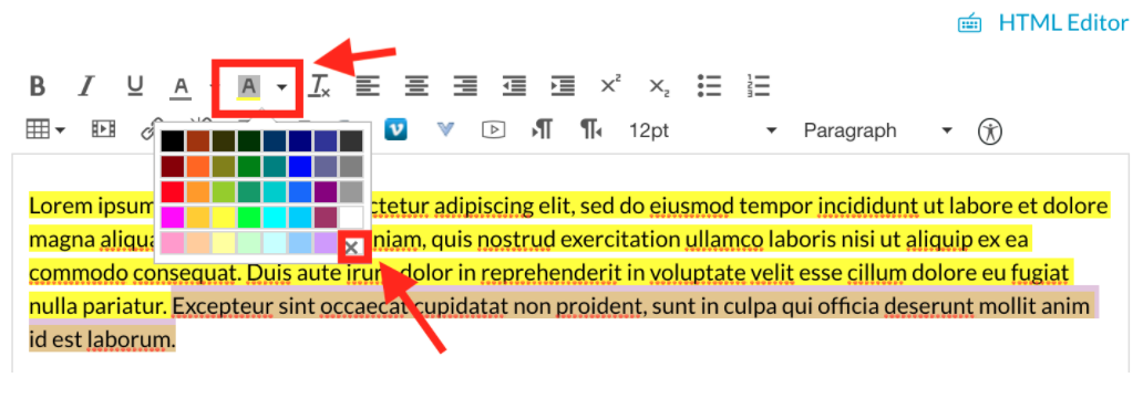
The fix: Follow these steps to remove the yellow highlighting:
- Highlight the relevant text
- Select the “background colour” option in the rich content editor
- Select the no colour (the icon with the cross)

3. Uploading videos directly into Canvas, instead of using Kaltura
This consumes your valuable storage (500mb storage per subject limit for teachers).
The fix: Upload video media using Kaltura. Embed that video from Kaltura on your Canvas page.
4. Not using heading styles correctly
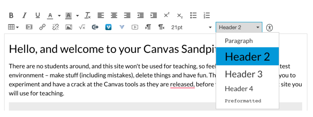
Users with screen readers need headings to skim your page and understand what it’s all about. If you don’t use heading styles, or skip the heading levels based on what looks good, you risk confusing them.
The fix: Use the heading styles found in the Rich Content Editor and follow the levels depending on the hierarchy of content on your page.

5. No context or explanation for resources
No one wants to endure reading through a repository of text-based content lecture notes, docs, or PDFs. How will students know what is required of them? And, how will you know if students have interacted with the content or not?
The fix: Provide some explanation before each file or artefact about what students are expected to after they have read/heard the lecture notes. Change things up a bit and add in interactive web content like a H5P module or comment box, short video clips, discussion boards, and video conferencing.
6. WRITING IN ALL CAPS
No need to shout! This can also be tricky for some people to read.
The fix: When in doubt, refer to the UTS Canvas Style Guide.
7. Trying to integrate Zoom by using the ‘Zoom’ tab
Zoom is actually not integrated with Canvas – there is a misconception it is because there is a ‘Zoom’ tab available in the Canvas subject site’s navigation bar.
The fix: Continue to use Zoom as normal. You can make meetings easily accessible to students by linking out to the meeting within the subject site (eg. via announcements, or adding a URL to a module/page).
8. Copying content directly off a Canvas page as you would with a Word document
This is not reliable. Depending on the content type and styling of that item on the page, you may lose information.
The fix: ’Edit’ the page directly in Canvas to access the content in the rich-text editor. Copy content from the editor, paste into the new page editing location. Alternatively, duplicate the existing page, update and remove unneeded content in the new location if you are working in the same subject site. Across subject sites, use the ‘Subject Copy’ functions in Canvas.
9. Overusing Comments boxes and Polls
Interactive tools help engage students with the learning content and capture their immediate responses. Just remember not to overwhelm students with too many activities.
The fix: Introduce the right balance of comments boxes and polls at the right times. Polls can be used to get a quick response that can be quantified. For example, social polls can be used at the start of a module asking students a quantifiable question for example a question related to a previous module. Comments boxes create discussion between students when unpacking the new knowledge or at the end of a module when wrapping up. Comment boxes can be used after a video or an article to gauge understanding of the content using open-ended questions. Make sure that a student responds to the comment box question before reading other students’ responses.
10. Uploading the same resource multiple times, instead of linking from ‘files’
This consumes valuable storage (500mb storage per subject limit for teachers).
The fix: Upload once – then access that same resource for re-use via the ‘files’ area in Canvas. For large files and media, consider using your UTS OneDrive cloud storage space and link to that. For video files, use Kaltura.
11. Publishing incomplete pages or modules
…or publishing pages, but not publishing the module. As well as looking unprofessional, this confuses students. Students will wonder if they are on the right Canvas subject site.
The fix: Publish only complete pages. For students to see the pages, the module needs also to be published. You can always publish any additional pages when ready.
12. Expecting to set and forget
Creating a polished Canvas site that includes interactive content may not guarantee an active learning environment. Unless you’re actively engaged with students and enough guidance is provided, Canvas will only be a fancy technology with a good looking interface.
The fix: The human element is important to facilitate the learning experience and create social presence. For example, being authentic and friendly, creating a sense of belonging, managing and participating in online discussion forums, sharing work experience, and sending regular announcements can foster active learning in Canvas and improve students’ experience.
More help & advice
If you’d like one of the team to cast an eye over your Canvas site, book some time with us.
Thanks to the many members of the LX.lab team who contributed to this post! Main photo by Andre Guerra on Unsplash.
