- accessibility
- data sonification
- data visualisation
- engagement
- evaluation
- feedback
- health
- UTSOnline
- week 1
In learning and teaching we can evaluate how our subject sites are performing by running a report from within UTSOnline. This is something I’ve worked on a lot lately, and it formed the basis of my most recent publication at the CSEDU Conference, ‘Supporting technology-enhanced practices for health academics’. The visualisations of this data from Blackboard are simple and intuitive. But what about sonification? In this post I will look at some examples here at UTS and some from friends, colleagues and inquisitive minds around the world.
Example 1
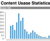
This data shows students’ engagement with a UTS Health orientation resource site in UTSOnline in Autumn 2016. The cohort size was approximately 800 students. There is good engagement in the first weeks of term with minimal activity after a few weeks – just what the site was designed for.

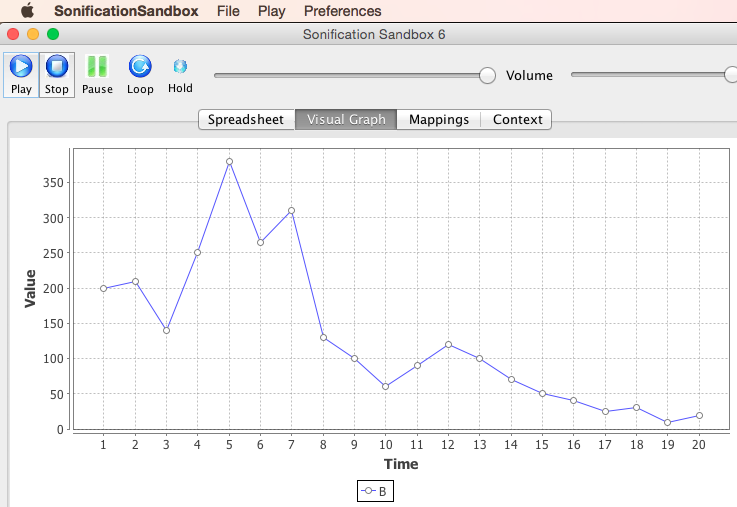
But what would this data sound like? I took the first 20 data points and plotted them in a program called Sonification Sandbox. If you’d like to try with your own data, the program can be downloaded from their website.
So this
…becomes this…
…and sounds like this. As you listen, look at the data points in sequence and follow the pitches as they rise and fall. This simply illustrates an example of sonification of data.
Digging deeper, what are we hearing? Higher pitches indicate higher views of content in UTSOnline over a period of weeks. For shorter time periods, think of a heart monitor. Each beep represents the patient’s heartbeat over intervals of seconds. It is not the sound of the heart beat, but rather a representation of its occurrence in real time. This sound has a pitch, a duration, a timbre, a loudness each assigned values for the context in which they are set, in this case, a hospital ward within audible distance of healthcare staff. If all is going well, a typical sequence of these sounds will have a tempo of 60 per minute for the average adult. Variations above and below this tempo indicates increased and decreased heart rate respectively.
CIC and the MDSI blog have done lots of interesting work in the data visualisation space. Roberto Martinez-Maldonado‘s MDSI blog post explores it further. A fact of our times, every day more than 2.5 quintillion bytes of data are generated. We can better use our sense of sight to digest a visual representation of data rather than looking directly at lists of numbers. A nicely visualised data set can be understood in a readily intuitive way, incorporating principles of Gestalt psychology, colour psychology and visual reasoning.
In data sonification, we can widen the range of types of data we are looking at, what these might sound like and how our sense of hearing can understand more things simultaneously (pitch, duration, timbre, loudness, pan, temporal and spectral changes) than our sense of sight can. As a musician, I think our ears are arguably a far more developed sense. Listening to ‘Dark side of the moon’ by Pink Floyd (as featured in our header image above), we can perceive hi-hats, kick drums, snares, toms, cymbals, bass, guitars, organ, synths, Gilmore’s and Waters’ vocals, backing vocals, weird spoken word vocals and even the air in the rooms of Abbey Road Studios. Visually when we look at something, we can focus on one detail at a time and all else is in our peripheral vision. So In sound, can we appreciate more things simultaneously? Though the timbres of the building blocks of music can combine to become a more complex whole, in most albums’ cases a finished stereo master sound file, or in surround sound movie soundtracks, we can still discern the building blocks of musicianship/audio and even the psychoacoustics within it. Can we do the same of sonified data? Or to achieve good sonification of data, is some awareness of musical/audio production a requirement? I feel that it is.
Evolutionarily, we heard our predators before we saw them. To ensure our survival, mankind developed acute hearing skills in a 360° range. Our range of vision is around 120°. And limited to a relatively narrow spectrum of frequencies. In hearing, our pitch spans about 20Hz to 20KHz. You can what this sounds like, and check how responsive your ears are in this example. Can we discern better between 10 octaves of sound from an orchestra than we can 40 shades of green? Or perhaps is one sense preferable to another subjectively? I wont arrive at an answer here, but it is fun to speculate. Comments welcome!
Example 2
Recent research conducted by a former colleague and current UWS Microbiology academic, musician (drummer with The Hummingbirds), and friend Dr Mark Temple has looked at using data sonification to convey the information content of DNA sequence data. His idea first appeared on The Conversation. It has since been published in the journal BMC Bioinformatics. But for listening purposes, these examples best present his microbiology data sonification ideas.
Here’s an example:
So here, he has used musical notes to find out something useful about DNA sequences, like where mutations occur.
Example 3
Mark’s work reminded me of the Al Bregman‘s work on auditory scene analysis and sequential streaming from my MA Music Technology days. If you are interested, there are more fascinating examples of Bregmans work online. If it is desirable for the sonification to reveal outliers, it would be worth considering how melody streams can overlap and interplay with each other and perhaps obscure that which you are trying to reveal, best described in this example below.
Example 4
A friend based in London, designer/musician and fellow Limerick man Martin Keary aka ‘Tantacrul’ has started his own YouTube Channel. The language used can be colourful at times, the critique often hilarious, but the ideas are right on the money and gave birth to this blog post idea. This video looks at the value of sonification and the good, the bad and the ugly ways it has been applied. Enjoy.
Among many areas covered here, Martin’s video touches on how data visualisation and sonification is an important tool for students with accessibility needs, which could be a space worthy of further exploration in learning and teaching.
In conclusion:


Drilling down to a more granular level, what would individual student usage in UTSOnline sound like? Deafening silence? Then we know we have a problem. Somebody hasn’t been accessing their subject site. If we have a minimal number of beeps, these will show up in our Student Activity Centre as a ‘student currently at risk’. And we can contact our students to point them towards content they may not have been accessing before now. And continuous or excessive beeps? We have a student who is happily engaging with content or perhaps confused trying to find something. To coin a data analysis phrase of Professor Peter Scott’s, “where is the heat and where is the light?” could become “where is the noise and where is the music?”

Finally, this sleeve artwork of Pink Floyd’s ‘Dark side of the moon’. As the spoken word outro of that iconic rock album says, spoken by the 70’s Abbey Road Studios security guy Gerry O’Driscoll, “there is no dark side of the moon, really. Matter of fact ’tis all dark.”
And though you can’t hear anything in outer space, back here on Earth, it is amazing what you can hear in the dark!

I like it, but I do have one bone to pick and that is when he says saying that “visually when we look at something, we can focus on one detail at a time and all else is in our peripheral vision”, and that “our ears are arguably a far more developed sense” because “though the timbres of the building blocks of music can combine to become a more complex whole…we can still discern the building blocks of musicianship/audio and even the psychoacoustics within it” citing the example of the different elements of a Pink Floyd song. I would argue that for a musician this is possible, but most people struggle, and a determining factor being how well the audio track is designed and mixed. Likewise, I would argue that a well designed visual can also work in the same way of letting you discern different building blocks while still being able to see those parts as a more complex whole. It all comes down to the thought put into the design in both cases.
Nothing against what he’s saying about data sonificiation (I am very intrigued by it) but his statement that music has an advantage is …a little overstated.
Martin Keary’s video is actually interesting, and shows some of the practical applications this could have (like accessibility applications as demonstrated by Wanda Diaz Merced). And although, as Keary mentions, there is a belief that we can better recognise patterns aurally than visually from noisy backgrounds, recognising a pattern and then translating it into intelligible data is another matter. For example, the stock exchange sound track will only make sense if you know the legend (what does a high pitch mean, what does a pause mean, etc.) in order to discern what those patterns mean. And because it is arbitrary, this will either need to be transposed for people who are used to different legends (essentially creating standard sonification languages that would need translating) or it would need to be designed, which, again as Keary points out, would be arbitrary and also requires degree of cleaning up the data, meaning that the noise would be filtered out (let alone the other biases Keary talks about).
The last segement of Keary’s video is spot on. Art is a mirror, but that does not mean it should just reflect the world back as it is. Art provides a statement about the world. A mirror can be a fun house mirror that warps and exaggerates features, or a gaudily lit dressing table, or a dingy fluorescent bulb soaked whole that make the lines of your face stand out like the the creases on a soiled sheet.