
At UTS we pride ourselves in setting a high standard for inclusivity so that students are provided with the best access to education as possible. In this post, I will go through how you can use the in-built features of Canvas to easily make your subject content more accessible to your students!
There are a few things to be aware of as an educator when taking into consideration the needs of your students. Because disclosing things such as visual impairments aren’t required for students to share, how will you know if all of your students are receiving an equal opportunity to access and to succeed in your subject? Here I cover two Canvas features that are quick and easy to use, but will go a long way in making your content accessible.
Using Text Headers
Headings are a great way to organise your subject site when wanting to provide page structure, however a screen reader won’t be able to pick up your headings if you only enlarge or bold your text. Screen readers require an underlying code to be able to navigate through a page according to the headings that you have set in place. This is why using the actual text headers within Canvas’ Rich Content Editor is important for screen readers to be able to distinguish the start of a new topic or block of information.
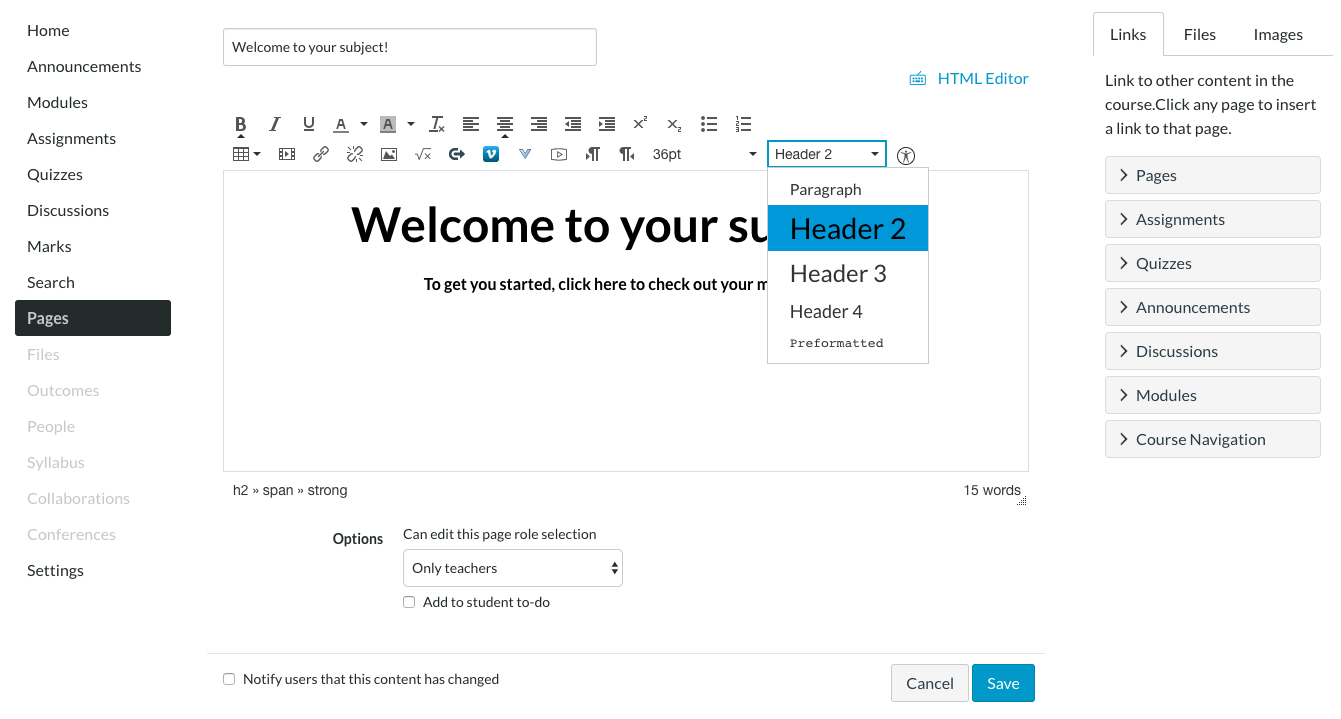
A great tip to help you structure your page is to first lay out a sequence for your headings. This will help you choose the most applicable heading level according to how you’ve intended to chunk out your information. Keep in mind to select heading levels based on their order of ranking, not their appearance, for the information to be correctly identified
Using the Accessibility Checker
Let’s do a quick little exercise: head over to a website you visit often, look at your screen, take a step back and squint your eyes until your vision becomes hazy through your eyelashes. How easily can you identify text, buttons and labels? Are you able to still navigate through the web page? Now think of your subject site. Imagine your students who see differently, going through and viewing your course. Is there anything that may impede them from being able to access or distinguish different types of information? Are hyperlinks clear enough to be identified as a hyperlink? Is there any highlighted text?
Canvas already has an accessibility checker to make it easier to take colour contrasting into consideration when building your site. This tool helps to guide you in choosing the colours to use for your texts and backgrounds, ensuring that it’s still readable to students that have hindered accessibility.
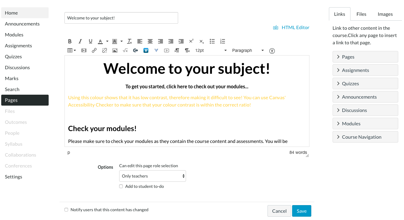
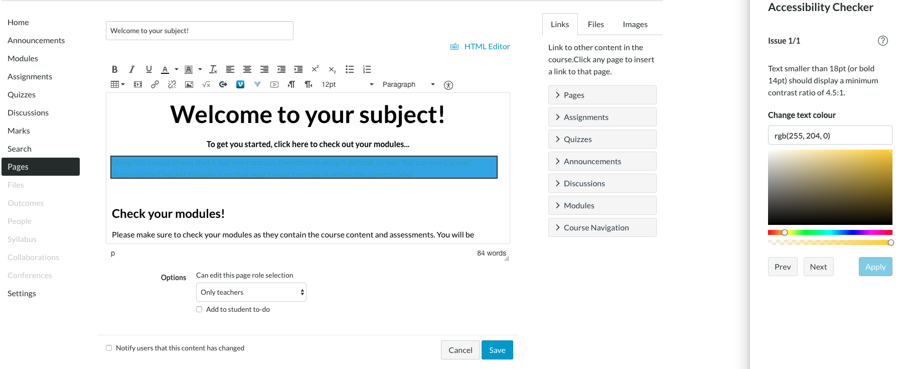
You can see here, that this shade of yellow does not satisfy the contrast ratio on a white background. The great thing is that the accessibility checker allows you to adjust the colour range until it passes that ratio.
The Rich Content Editor offers 40 different font and background colour choices as well as other features to help make your content engaging! Even though this may excite and motivate you to get creative with making your subject site eye-catching and fun, it’s important to consider how easily readable your content will be for all your students. You can find an accessibility guide within Canvas Community: General Accessibility Design Guidelines
If you want more information on making your site accessible in Canvas, get in touch with the LX.lab via ServiceConnect.